Monday, 20 December 2010

Do's and Dont's

Do's
  • Use colours that work well with eachother.
  • Use a image which you have taken from a digital camera.
  • Make sure th font is readable and suits the genre of the music and artist.
  • Have a picture of the artist.
  • Include the record lable and barcode.
  • Make your digipack suit your genre.
  • Space text and images out.
Dont's
  • Do not take a picture off facebook as it will look pixlated.
  • Do not streach the image.
  • Do not use more than 3 or 4 colours as colours could clash and make your cover look cheep.
  • Do not add too little or too much detail.
  • Do not cluster everything together.

Draft of my digipak


Monday, 13 December 2010

Analysis Of Digipaks And Adverts

front and back cover jls album Pictures, Images and Photos

JLS - JLS CD Back cover

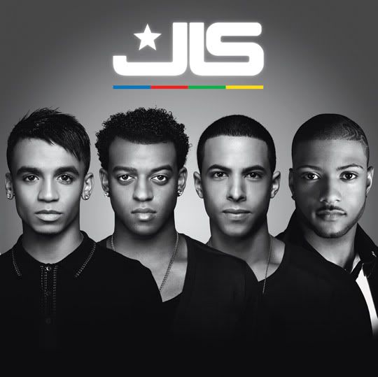
This is the front and back covers of JLS's debut album. It uses very simple colours and no fancy effects of images, just the faces of the artists and their name. The fact that there is no additional suggests that the title of the album is also the same as the artist name.


JLS, Brit Award Nominee Album Out Now


This is the advert that goes along with the album. Its simple and straight to the point and uses the actual album itself to promote the album. It also features information about awards they have won, their website and when its out.


This is the front cover and advert to Lady Gaga's 'The Fame Monster Album' the album cover is very basic and simple. It just has the artist her name and the album title. This makes it quite noticeable and there is no need to search for it because its advertised boldly. Below it is the advert for the album, while it doesn't use the whole album cover it uses the main part which is her face so that customers will be able to recognise her. Also the artist name and the title of the album are in a large font in the centre of the page so that you instantly know what the advert is about. There is also the use of a long letter 'T' which is similar to having a symbol which also makes the advert recognisable. At the bottom is information of the songs in the album and a visual image of the actual CD itself.


The first picture with the bear on the front is the front cover to Kanye West's 'College Dropout' album. I personally found it quite interesting because al there is is an image, the cover doesn't not state the album title of even the artists name. This may just be an act of creativity of a way to get people to notice the album and pick it up. The album does however feature Kanye West signature bear who appear on all of his other album covers. The colours are very earthy and the bear seems to represent the title of the album because he is just sitting on a bench as if he has dropped out of college. Below that is the advert for the album and its presented as if its just things on a table. This advert actually features all the important things which the album cover did not i.e the artists name and album name. It also has a picture of Kanye West himself.

Friday, 10 December 2010

Audience Feedback


Adverts

This advert is for Calvin Harris release of his song 'Ready for the weekend', this is promoting as well as selling his song as it is ready to download. the colour scheme is very simple as it is only white, purple and black, and the text is rather simple and plain. But overall is easy to read.


This advert is the same as the one used for the advert above, very simple, straight to the point.
This is an advert promoting Rihanna's album 'Russian Roulette', this picture is also used on the album and is good so when people go to the shops they know what the CD looks like. Also the colour scheme works well as the red stands out on the black and white back ground. This advert is very Gothic but aims it self at more that one type of audience.

digipaks


This digipak is very bright and vibrant, there are many colours in which stand out and will catch many eyes in the shop.The space theme goes through both front and back of the digipak, it looks very fun and professional. Even the CD its self is brightly coloured to match the case. Also the yellow text works well with the black background, and on the front cover the artist name is in bold white writing with a 3d effect stands out. This whole cover looks like they are in a fantasy world.


This digipak is the opposite to the first one as the colours are more dark. This cover has more of a magic feel to it because the man is wearing a white mask, also this could suggest he is maybe hiding something. the white on a black background works well and u can see the text clearly. The artists name is in graphite which is rather hard to read but over all a good digipak.
Lastly this digipak has more of a calm tone and a warm colour scheme to it and it has a blend of brown white and yellow and black. The picture of the guitar shows the genre of indie maybe rock. The writing is bold enough to see and the colour scheme travels all through out the digipak.

Planing

My digi pak is going to have a black, grey, white and red colour scheme, with floral prints and a close up of the artists face. The reason why i would like a floral theme is because in our final edit of the music video there is a white rose which floats away in the water at the end of the video which symbolises the death of a friend, so i wanted to bring that in so that the digi pak and song have some form of connection. The reason also to why i chose those colours is because with the red it will make the digipak look vibrant but with the black, white and grey it will tone it down a bit. This cover i will aim it at teen girl and also earrly 20's woman who like pop and soul music.


Friday, 26 November 2010

Final Video

Final Song Choice


This is the song we chose. The video is unreleased and appears be the actual recording for song. We liked the idea of it being simplistic so we based our video on the studio theme. We though that it was too simplistic and boring so we added a narrative to our video.

Rough Cut Video

Rough Cut Feedback

After looking at out rough cut the teachers decided that we needed to have a wider variety of shots. We initially felt like the shots we have from different angles were poor due to the bad mise en scene but the teachers said suggested that they weren't all bad and that it was better to have different shots with a bad mise en scene than to have limited shots. Also it the memories which we portrayed in video should be slowed down and shown in black and white to add emphasis. They also suggested that we add more people in the video because in the beginning there was only Bridie and Marilyn and it was suggested that the relationship between them made them seem as if they were in a relationship rather than close friends, so we went out and got some people to pose as other friends.

Analysis of the sequence

I have taken this shot from our video, we changed this by zooming in so we are focused on the artists face and also so it blocks out the door as it looks rather scruffy. Also we added a light because the setting is very dark. We had many problems getting the shot right because the studio was rather small to fit us all in and including the camera and tripod. Overall it worked out well and we managed to get the shot we needed.

Feed back from the rough cut

Our rough cut video compared to our finished copy is a lot better as it is more organised and we have added lots more shots from different angels and added more people to the video to make it look more like a relationship between two friends. In our video we only had a one angle shot in the studio, so what we had to do is use the clip that had no lighting and adjust them and add them to our clip to give the impression that it was shot on two different occasions. Even though the shots are darker, they needed to be added in order to keep the audience interested.
In our rough cut also we had a totally different idea to how the final edit is now, we was just going to focus on the friendship between two people but because it looked more of an obsessive friendship, so we added a clip of other people to break it up a bit. Lastly in our rough cut we had many pictures, we changed this because we felt like it didn't look right and didn't fit the song well. However we changed some of the sequence from colour to black and white.

Test Shots & Lighting


These are shots taken from the actual filming of our video. They are some test shots which we took to establish the lighting in the studio. As you can see the first couple of shots were dark and therefore we made the decision to add the lights onto the camera. The shots of the microphone are to show the mise en scene of the studio. The soundproofing material didn't cover the whole of the studio which made it difficult for us to get shots from different angles and still maintain a decent mise en scene which is why are shot choices in the studio are limited. Despite this problem we did film various angles and tried to cover up the bits which were really bad. We did this so that when it came to editing we would at least have a choice of shots and  we would have the opportunity to edit out what we felt necessary.  

Thursday, 25 November 2010

Audience Task

Shea lives in Romford and is seventeen. She is black African and is currently in college and works part time in h&m as a sales assistant. she does her shopping every friday with her mum in tesco. In her spare time she listens to music.( R'n'B).Her favourite artist is alicia keys though. She reads the metro and enjoys reading the magazine bliss and more. Her favourite transport is the train and she is never caught dead without her blackberry and navigator in her car. Her favourite brand is Louis vutton. She often buys her clothes from h&m and top shop. Her favourite drink super malt. Shea really wants to go on holiday to Ayah Na pa with her friends for the summer. Finally she is a aspire/ main streamer, this is because she loves being centre of attention and always has the latest things. She is a independent women who stands her ground. She enjoys raving and dancing . Her favourite programme is the Monique show and four days a week she catches up with eastenders with her family. She is also family orientated and eats dinner with her family every sunday.

Teachers feedback

Our teachers really did enjoy our video and their feedback was to use more shots of other angles we had of our artist singing. Despite the fact they were dark we should lighten then, as it is better than having our video from one angles. They said we should be careful with the effects and put the memories which the singer has in slow motion and black and white to make them more effective. Finally Make sure i try my hardest and do the best we can in order to achieve the best grade possible.
I feel after this feedback i can ensure our video will be able to achieve the best grade possible .


These are few examples of the shots we took. However the Mise en scene affected our shooting as we didn't want our video to look bad. Also the fact of wearing headphones to make our video look like a replica of pixie Lott's.

Shots of potential planning

 This is the studio which we filmed the duration of the song in. We used various shots and angles to show the variation of our artist singing.

We used the Lime house wharf as the set of where our artist drops a rose out of respect and the loss of her friend.


We used the bedroom above to take photos to show the relationship between our artist and her friend. to show how they were really close.

We wanted to relate to the original video by kings of Leon and have a shot of the city. Canary wharf. However we later changed the concept of our video and did not later need it.

We had numerous ideas of where we were going to shot. At first we wanted to shot in a studio which we did as you can see above. cable street studio. We then came up with the idea to shoot our artist by the lake. We ended up shooting the video at lime house docks. These are the main areas which we shot at.

Sunday, 21 November 2010

Teacher Feedback

Hello group 34
Pop into workshop one lunchtime this week for a teacher or technician to show you how to get your rough cut up on your blog.  We are using a package called handbrake for this - it will convert the file into the correct size for the blog.  You will also need to blog a summary of the feedback that you got from Jo and I on Friday - along with some comments on how you intend to act on this feedback in your final video.

Friday, 12 November 2010

Photo's From filming sessions


These are a few photos from our video at the river side and in my (bridie)house. We changed our location from Angel to the Isle of Dogs as it was easier and was a better place to do it in, also we wasn't disturbed by anyone walking past. Also the day we shot the video on was grey and windy which suits the sad theme we are putting across.

Tuesday, 9 November 2010

Teacher feedback

Hello group 34
Don't forget to put up some of the photos that you've taken during your filming sessions to show where you filmed.  Add some comments underneath explaining why you've to film there (or why you changed your mind).
Keep up the good work (and could you change the colour of the font to black - bright green makes it almost impossible to read!).

Friday, 15 October 2010

Pitch: Question 9

For my digipak i will be producing a 4 panel one and it will contain a front and back cover and also a inside cover which have one image of the artist and another image or patten which will go with the rest of the images.
On the front of my digipak i will have a close up of the artist face to show her confidence and on the back cover maybe a low angle shot to show her innocence's which will also include the artist other songs as well. I am considering doing the digipak in black and white as our video might be in black and white also, but i may re think this idea because colour stands out and i want my digipack to stand out to the target audience. In my advertisement it will include the front cover of the digipak to show the end product and also bold colourful writing and which will have information of where our video can be seen e.g YouTube. And social networks in which we will be advertising our video on.


 FRONT COVER


            BACK COVER


INSIDE COVER


Thursday, 14 October 2010

our animatic for our video

Our pitch

My Answer of three questions


I plan to use the digital technology in the production of our three products . I plan for my package to help promote our artist and create a produced out come. The equipment and setting will help relate to that as the camera will clearly do our recording for the footage of our video. Finally after the video is complete I plan to blog it and use video to publicize the video. Possible receive feed back on the video, and get a positive response.


The three image which I have used re all different ways in which our video could be advertised.

During As i had learned a lot in sense of how to use final cut and sound track pro. Since being in a2 i have learned how to further my knowledge by cutting clips and adding them to photos and making a final product where they all flow at the same time. i have become more understanding and i have learned improvements on how to use our ideas all together and combine them into one great idea. for the best outcome of our video